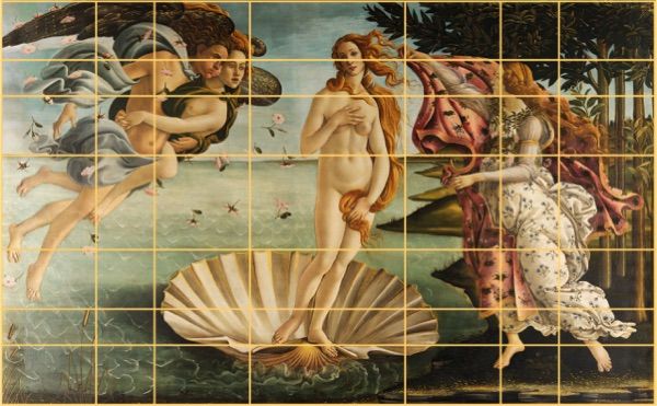
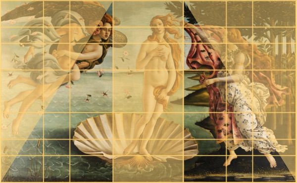
Three vertical subsets are shown below. The dimensions of the right and left rectangles are proportional to the outer dimensions of the painting. Each of these rectangles forms a Golden Rectangle. The various figures are arranged on the diagonal of these rectangles.
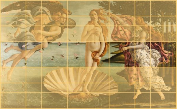
Another horizontal cutout below: the upper rectangle delimits the horizon line, on which Venus' navel is aligned. The lower rectangle contains the shell. These two rectangles are in 5/8ths proportion to the height of the painting, the proportion governed by the Golden Ratio.
Venus is in a central position. The rectangle containing her is equally proportionate to the outer rectangles. She's not in the middle of the picture: the axis of her body is on the vertical red line, again based on the same principle of proportionality, at 5/8ths of the median rectangle.
Let's superimpose this same regulator line on a watercolour structured according to this principle.
The horizon line is placed on the low horizontal primary gold line. On this same line is located the main vanishing point, which determines the building's perspective.
The straight vertical primary gold line separates the building from the tree.
The intersection of these two primary lines defines the painting's focal point: a table and two chairs sheltered from the heat, and two glasses of wine being served, awaiting the occupants of the house.
Here's the table without its construction structure:
The painting is balanced by a structure based on human proportions. We see these proportions all day long: the shape of a face, the phalanges of our hands, the proportions of the bodies of people we pass. So it's only logical that the human eye should prefer a structure based on familiar, reassuring proportions.
It should be noted that this "regulating layout", this structural grid, does not represent an instruction manual in itself. It is simply an aid to decision-making, and saves the painter a considerable amount of time. Among other things, it makes it possible to place lines of force quickly and efficiently, and to avoid "off-center" subjects of interest.
Le Corbusier, the famous Franco-Swiss architect, said: "The regulating line doesn't bring poetic or lyrical ideas; it doesn't inspire the theme; it's not creative; it's a balancer. A problem of pure plasticity".
In 1945, Le Corbusier developed the "Modulor", a system of measurements based on human proportions. He felt that this system was better suited to human morphology, and would enable maximum comfort to be achieved in man's living space.
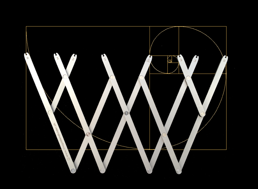
The tool used to quickly trace the structure of Botticelli's Birth of Venus in the video on this site is called the "Golden Divider for Arts".
This compass of proportions was developed by the author of this site to facilitate the work of creative people in many fields: painters, of course, but also sculptors, photographers and graphic artists, as well as architects and other designers.
It was awarded the silver medal at the 44th International Exhibition of Inventions in Geneva in 2016.
Click on the link below to visit the "Golden Divider for Arts" website.
the "Golden Divider for Arts" eliminates the need for a ruler and calculator when tracing complex structures. Among other things, it makes it easy to trace a Fibonacci spiral. It can be used as a compass with a radius of up to 75 cm.
Opened at right angles, it can be used to trace the emblematic measurements of the cathedral builders of the Middle Ages: palm, palm, empan, foot and cubit.
These different measurements remain proportional according to the angle at which the tool is opened.
The "Golden Divider for Arts" is a plotting, measuring and sighting instrument for anyone whose project starts with a pencil and a sheet of paper!